Design System
Evolving a Design System Across Products
I used Shield, U.S. Bank's design system, as the foundation, extended its components with new variants, and created the onboarding patterns it didn't have. Every addition followed Shield's guidelines and went back into the library for any team to use.
1,500+
variants created
50+
component groups
8
product lines supported
100%
added to the Shield library
Role
Product Designer, designed and maintained the onboarding components within Shield
Team
Engineers, PMs, an XA, a content strategist, and an accessibility consultant
Tools
Figma, Shield design system, Userzoom, Storybook
Product lines
Credit card, checking, savings, HELOC, mortgage, personal loan and line, BNPL, partner cards
The Challenge
Shield had the foundation, but not the onboarding patterns
Shield, U.S. Bank's design system, gave us the foundations: type, color, spacing, accessibility standards, and core components like buttons, inputs, and cards. The new onboarding journey (first login, a dashboard widget, and a task console) needed patterns Shield didn't have yet: task tiles, progress tracking, product welcome screens, and feedback messages that worked for every product the bank offers.
Each product brought its own rules. A credit card customer activates a card, a checking customer funds an account, and a mortgage customer sets up payments. The new components had to follow Shield's guidelines and flex to all of them, without becoming a separate system.
My Role
I extended Shield for onboarding
I worked within Shield rather than around it. Where Shield already had a component, I used it. Where it was close, I extended it with new variants. Where there was a real gap, I designed a new component that followed Shield's guidelines for spacing, type, color, and accessibility.
Every component went through review with engineers, PMs, and an accessibility consultant before it was added to the Shield library. I also wrote the annotated specs engineering built from, covering interaction rules, content logic, and accessibility notes.
How I Decide
Use Shield first, extend it with evidence
For small decisions, Shield's existing patterns guide the call. When there is real disagreement, especially on effort versus payoff, I test instead of debating.
New need
Does Shield have it? Yes: Reuse it. Close: Extend it. No: Build new to Shield guidelines.
Team disagrees? No: Ship and document. Yes: Test with users, then ship and document.
This kept every new component consistent with Shield while still letting onboarding move forward.
Progress Indicator
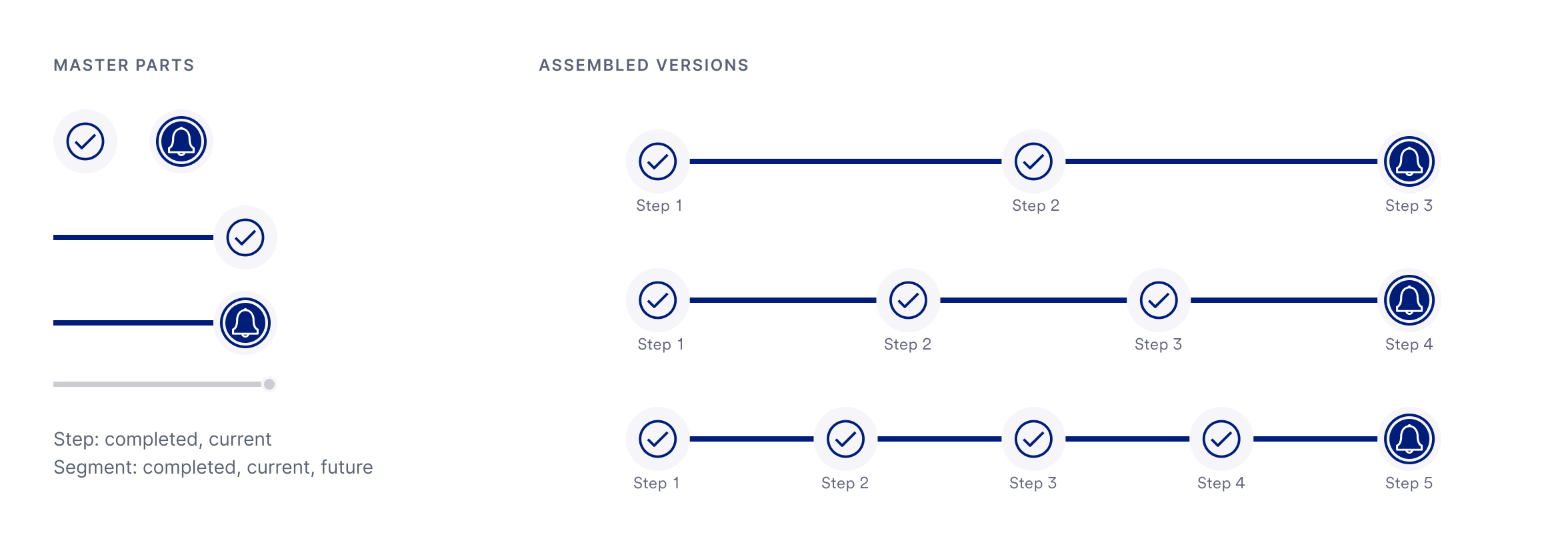
Built from two master parts
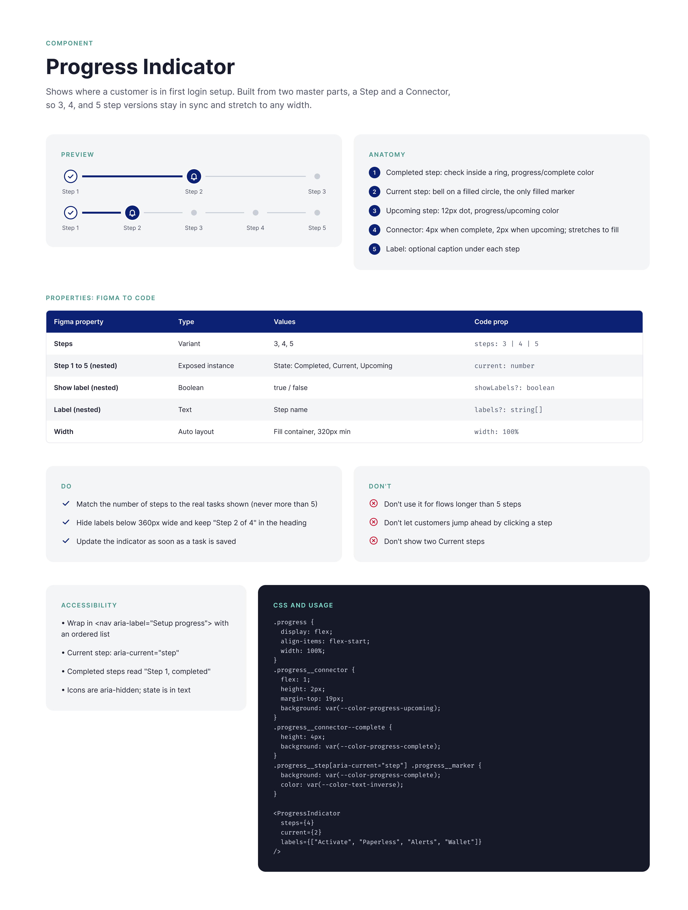
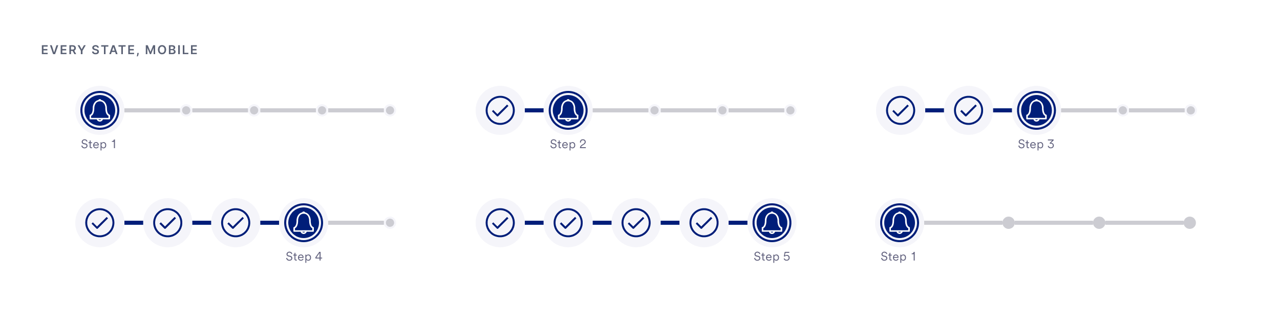
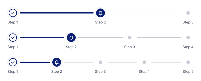
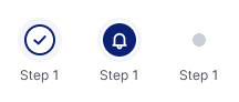
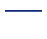
A step and a segment combine into 3, 4, and 5 step versions for desktop and mobile. Update a master once and every version follows.
Progress indicator variants
Step states
Connectors
How I Worked With Shield
Use what exists, extend what's close, create what's missing
A design system scales when new work builds on it instead of around it. I followed three rules for every onboarding need.
Used.
Shield's foundations and core components: type, color, spacing, grid, buttons, and form fields. No new styles where Shield already had an answer.
Extended.
Shield components that were close, given new variants and states for onboarding, so teams didn't end up with near duplicates.
Created.
New patterns Shield didn't have: task tiles, the onboarding console, product welcome screens, dismiss modals, and full page error states, all built to Shield's guidelines.
Every new component and variant was reviewed with engineering and accessibility, then added to the Shield library for other teams to use.
Toast Messages
One pattern for every outcome
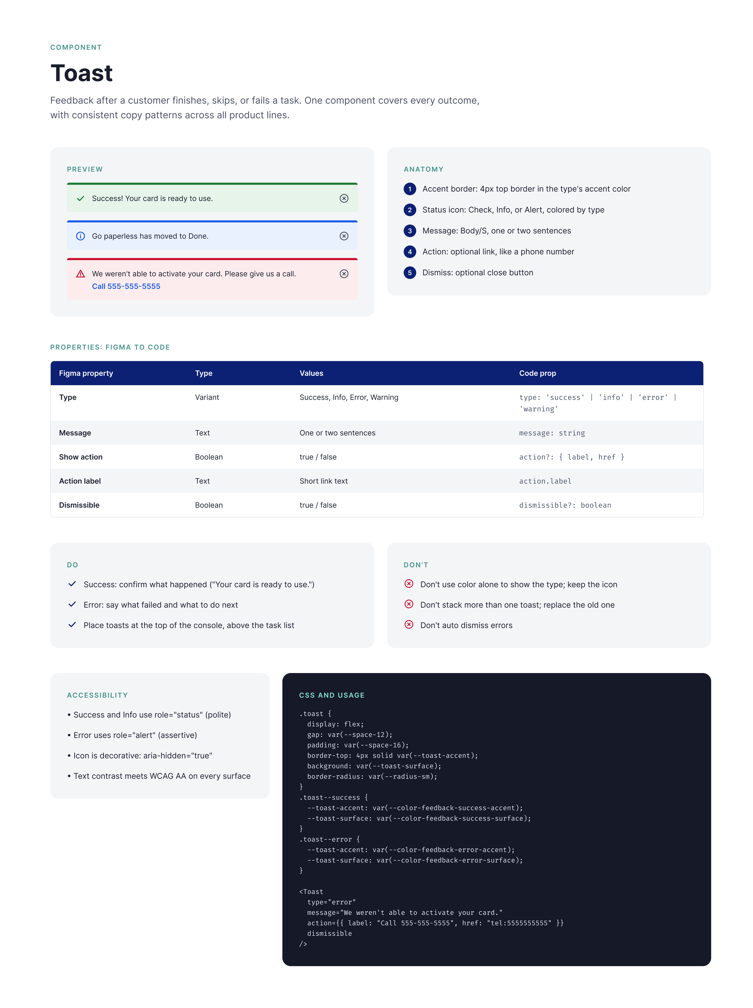
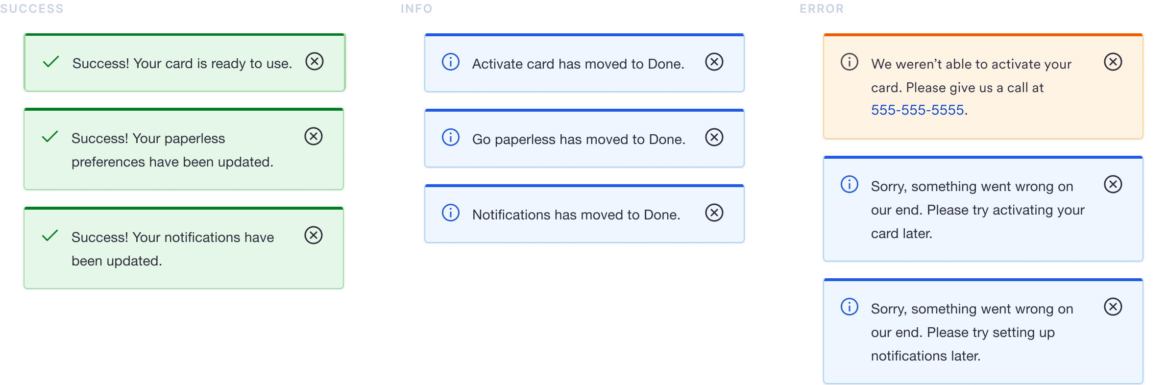
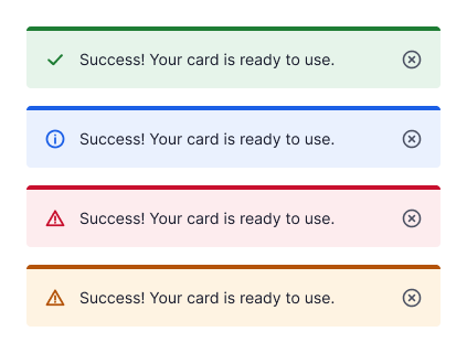
Success, info, and error toasts share one structure, with consistent copy across all eight product lines.
Task Tiles
One tile pattern, 25 setup tasks
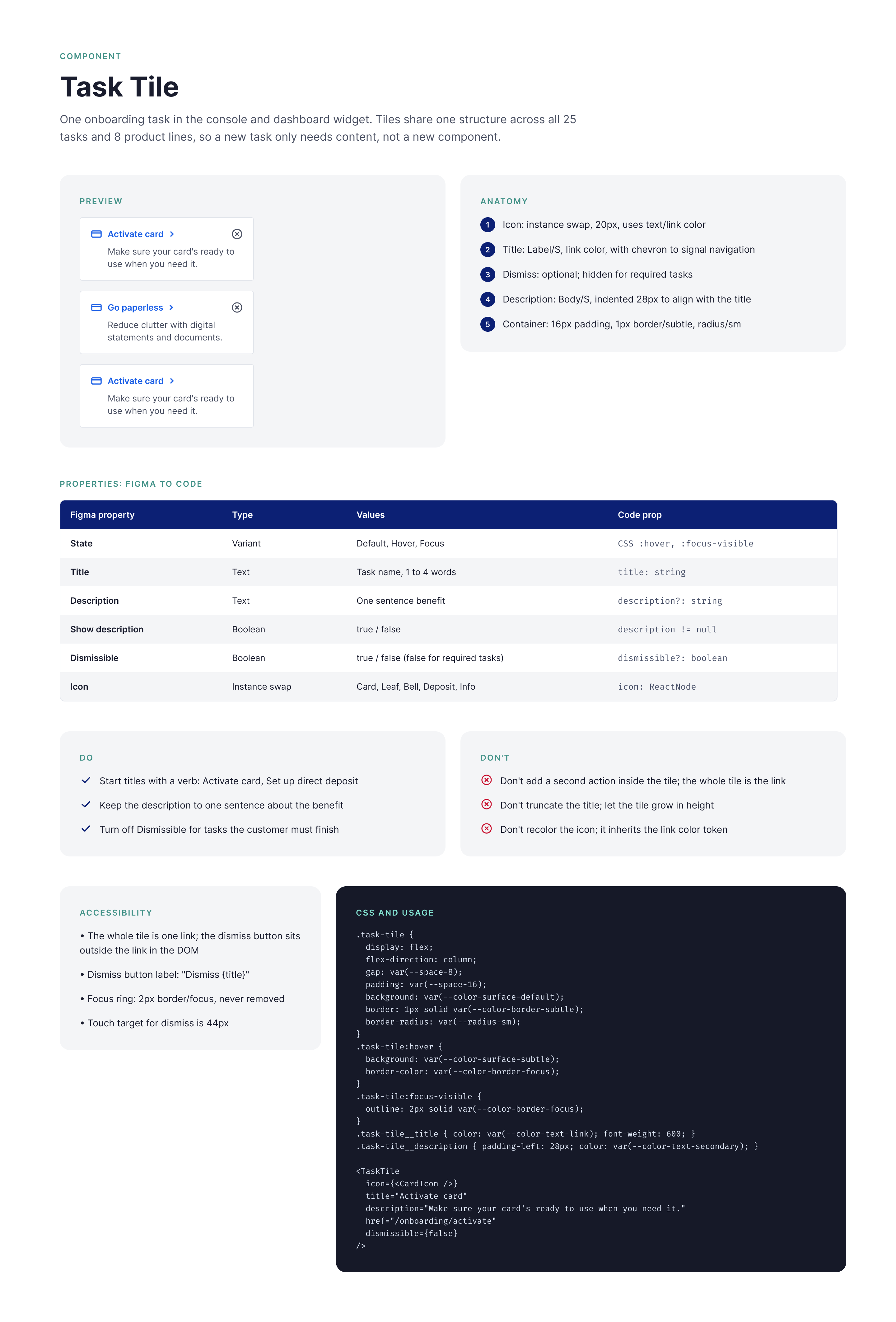
Every console task shares the same tile: icon, title, chevron, description, and dismiss. Specs hold at 250 and 320 widths.
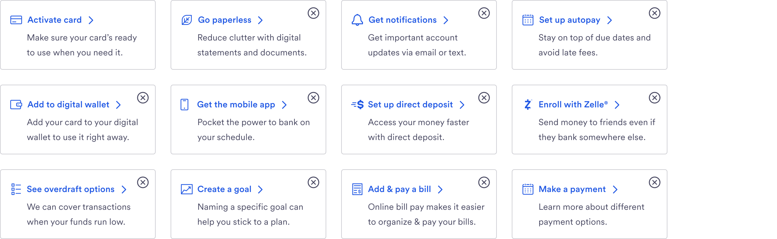
Tile states

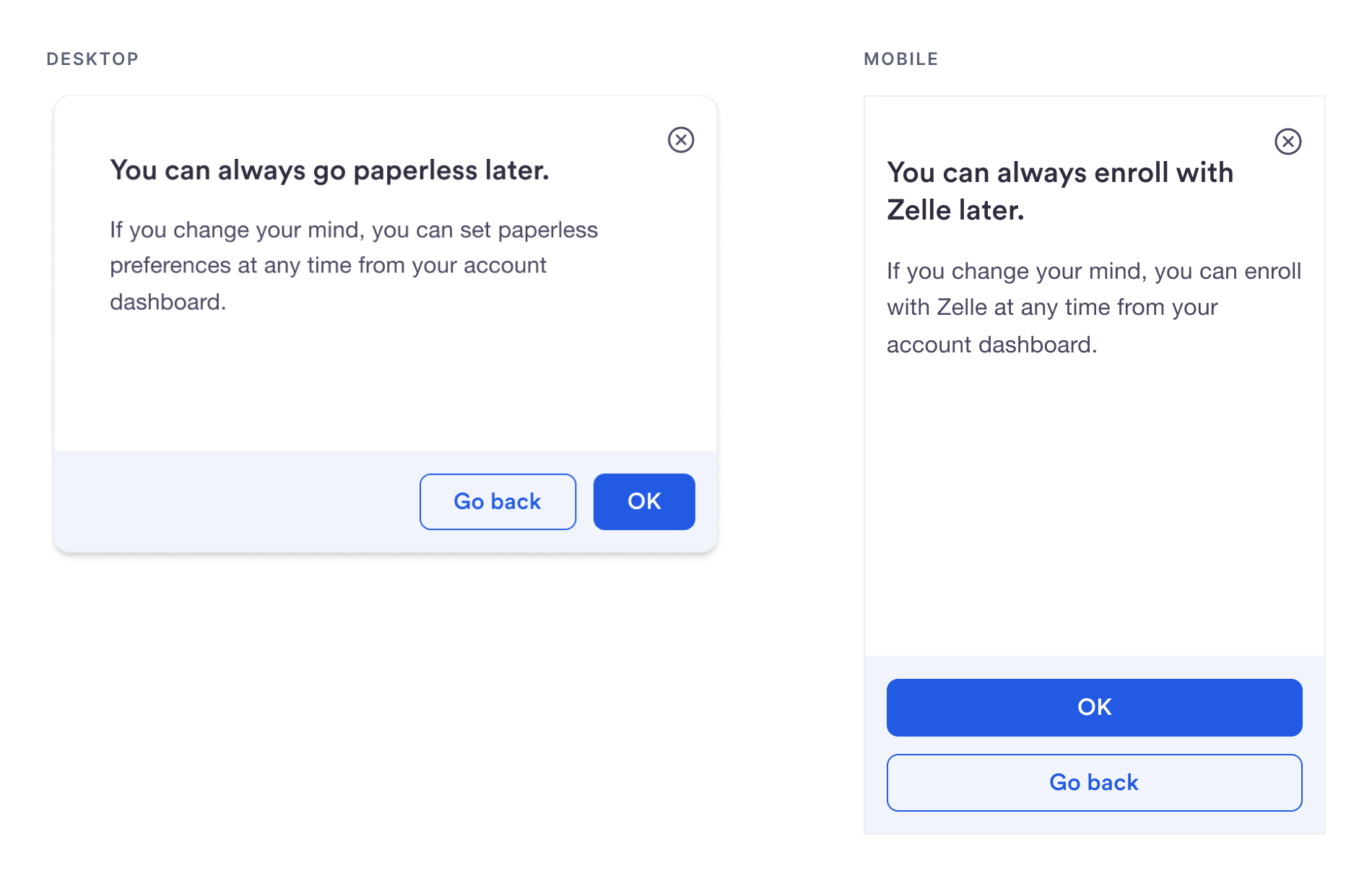
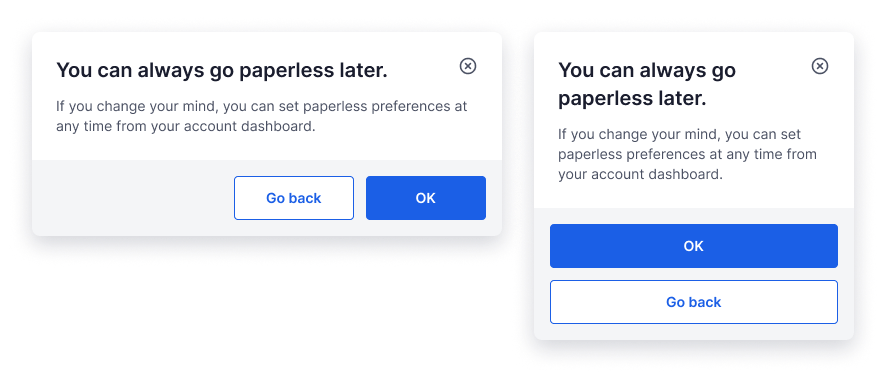
Dismiss Modal
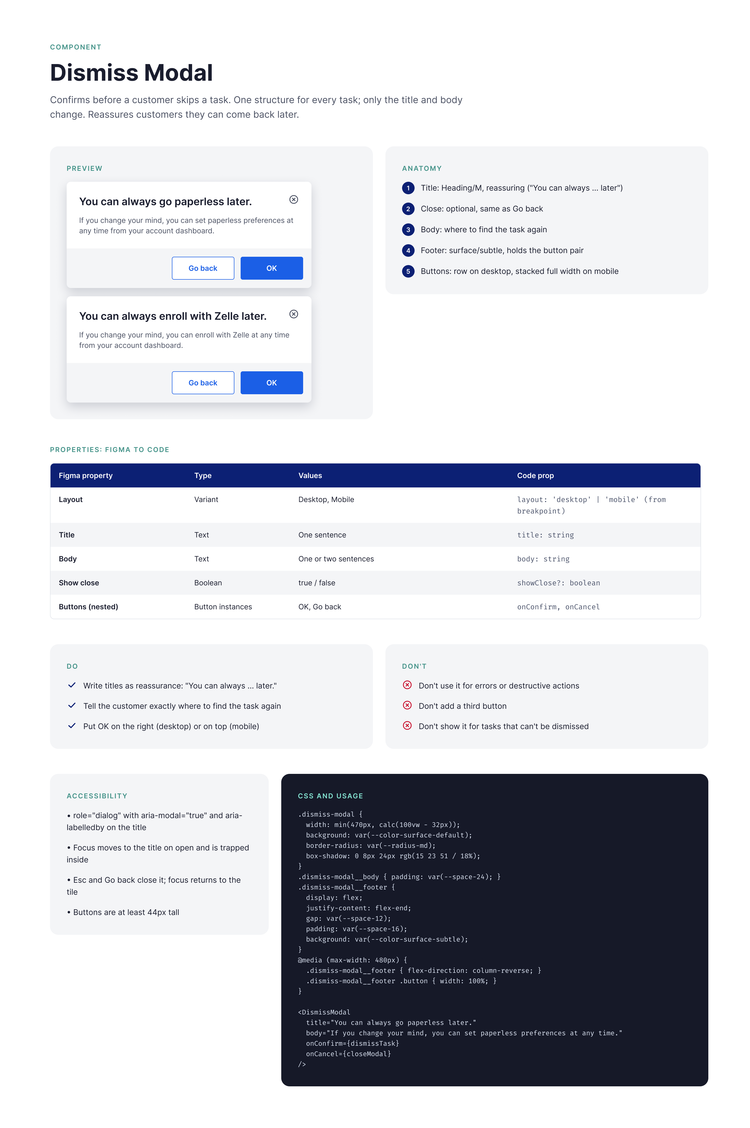
Same structure, task specific copy
Before a customer skips a task, one modal confirms the choice. The layout and button pair stay fixed while the copy adapts to each task.
Shield 2.0
When Shield 2.0 and a new brand launched, I updated every onboarding component to match
The update brought a new typeface (Circular), a new color palette, and a new light theme.
I rebuilt every onboarding component on the 2.0 foundations while the products using them stayed live. Because the components were built from shared master parts, updates flowed through to every product line instead of being repeated screen by screen.
Edge Cases
Designed for the unhappy paths
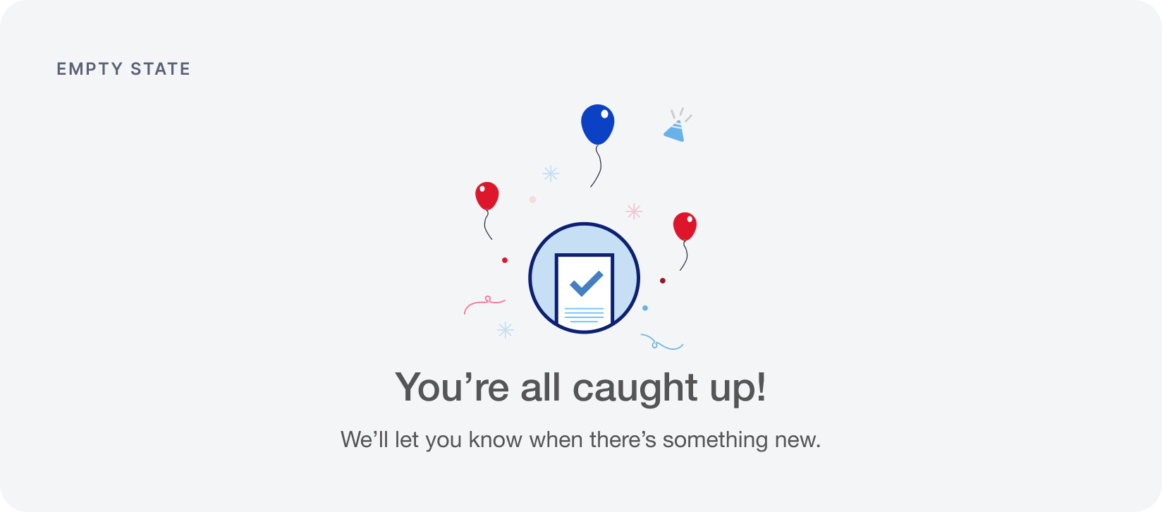
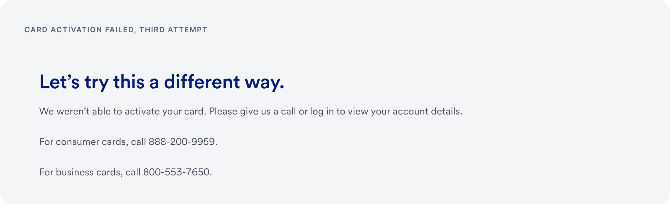
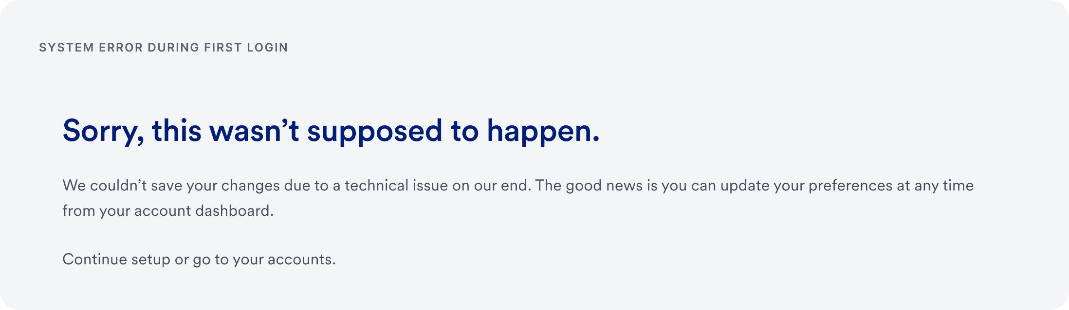
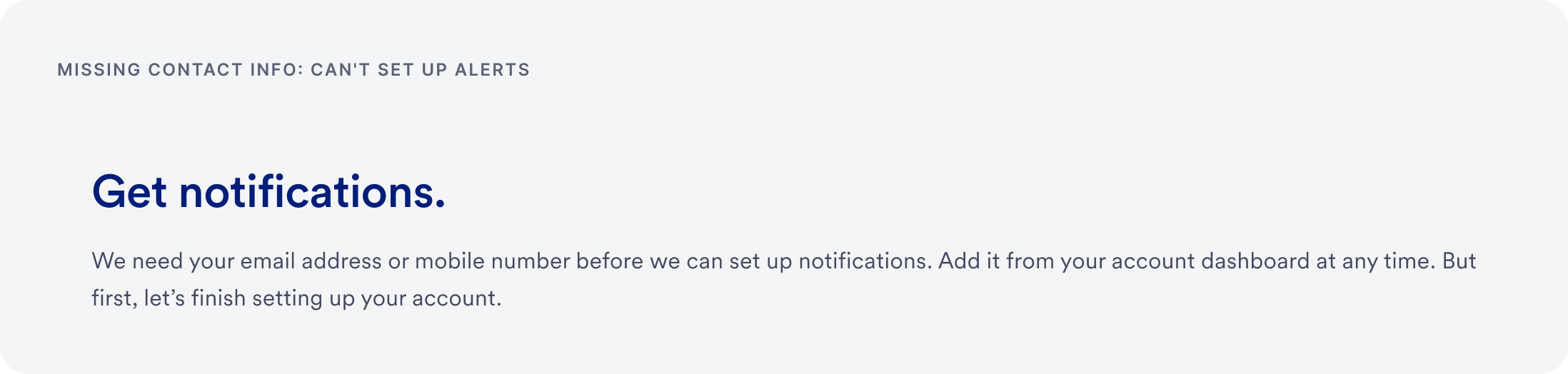
Full page errors cover failed card activation, system outages, partial success, and missing contact info, so every failure tells customers what happened and what to do next.
Card activation failed, third attempt
System error during first login
Missing contact info
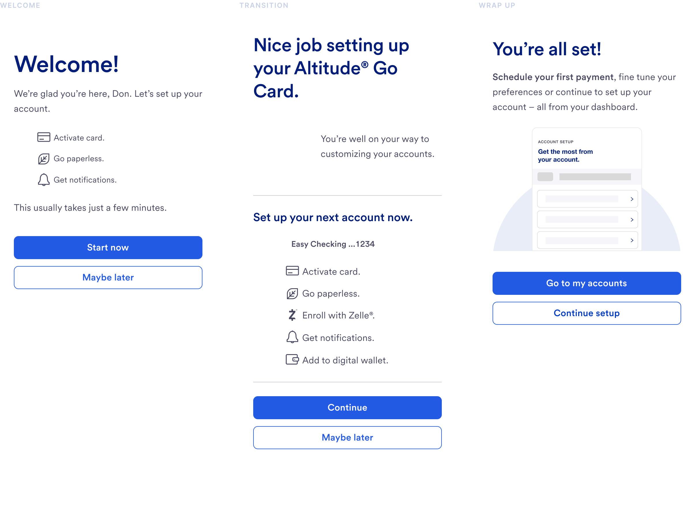
First Login
Assembled entirely from the library
Welcome, transition, and wrap up screens from first login, each one built from the same shared components.
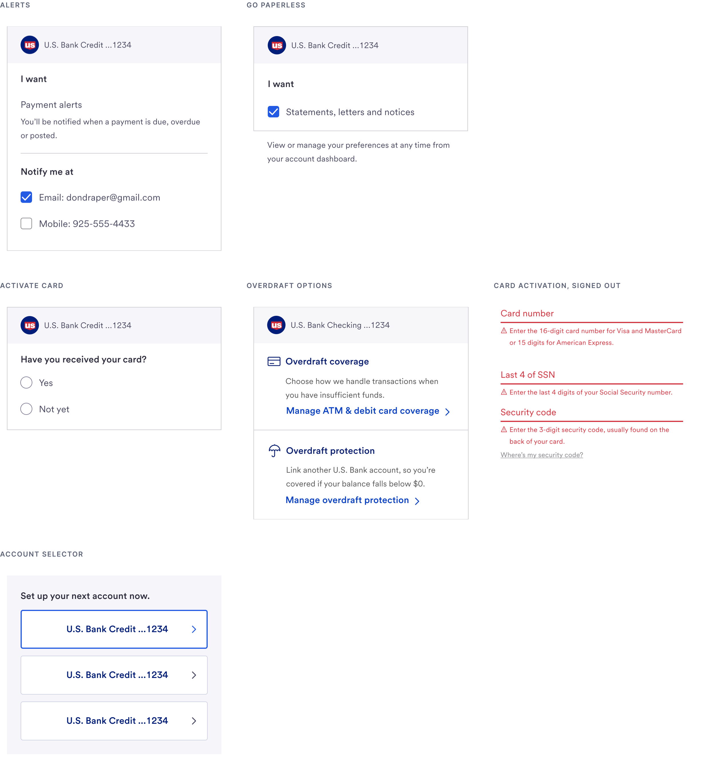
Setup Tasks
Every task page, built from the same parts
Alerts, paperless, card activation, overdraft, and account selection share headings, content areas, and button sets, so each new task ships faster and stays consistent.
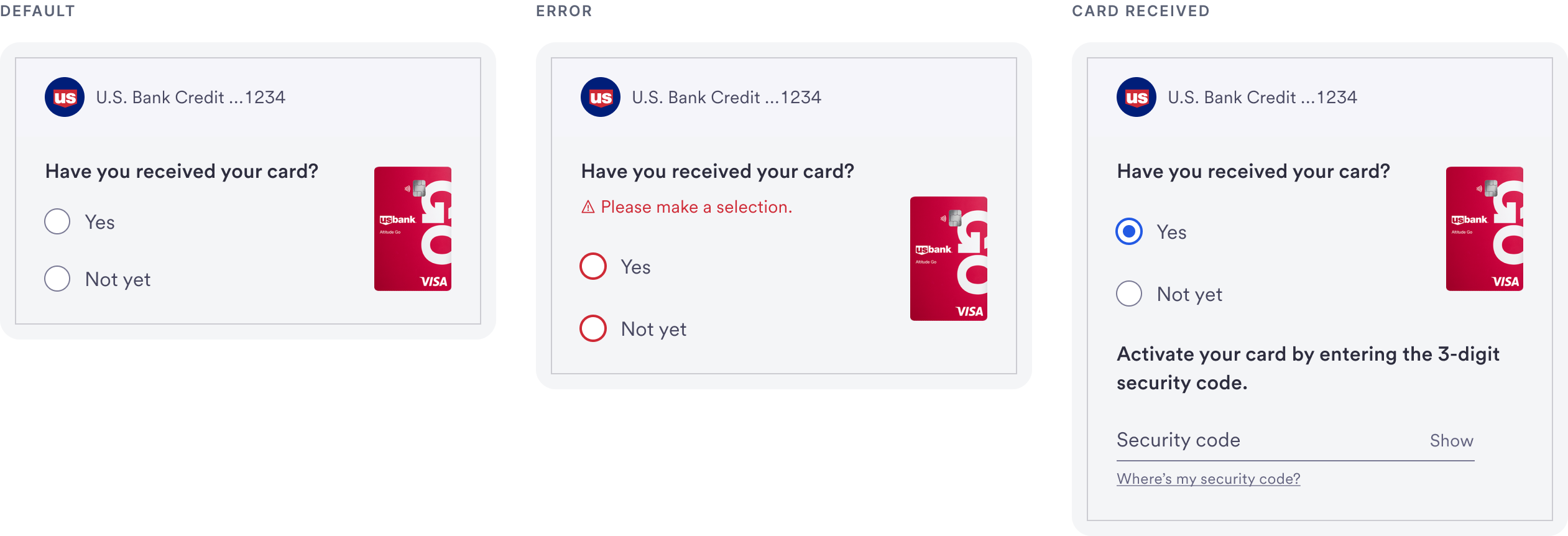
Component States
One component, every state
The activate card component covers the default question, a validation error, and the follow up when a customer confirms they have their card.
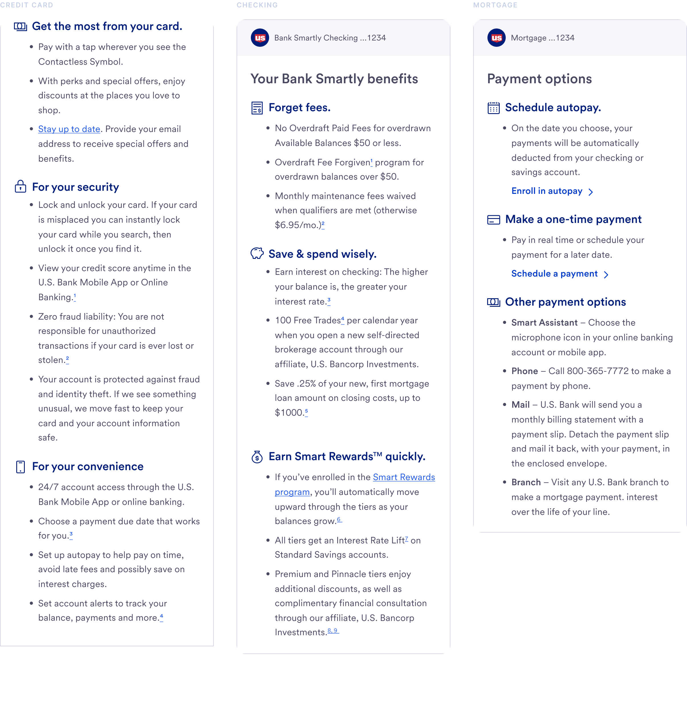
Product Benefits
One template, product specific content
A single benefits page template flexes across credit cards, checking, and mortgage, with disclosures that grow or shrink by product.
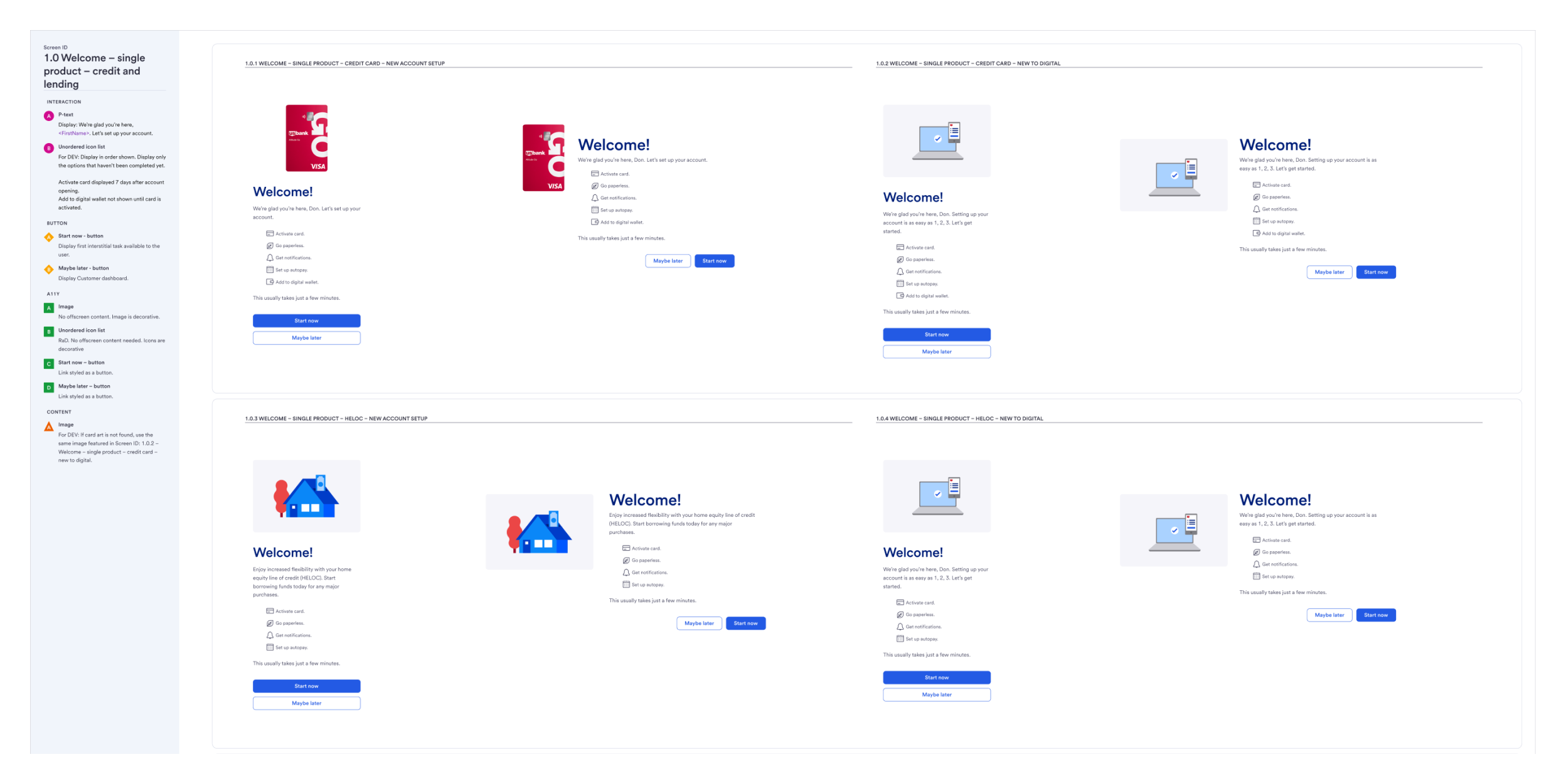
Documentation
Specs engineering could build from
Every flow shipped with annotated specs covering interaction rules, business logic, content notes, and accessibility. They also captured business rules, like the limit of four accounts onboarded at once and which account is selected by default.
Extended Onboarding
The console, built from the same library
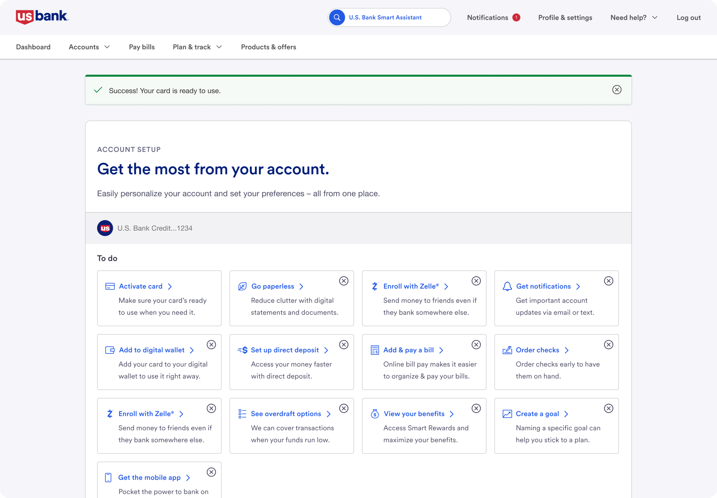
After first login, customers finish setup at their own pace in a console assembled from the same headers, task tiles, dropdowns, and toasts.
More Setup Tasks
The same system across every account feature
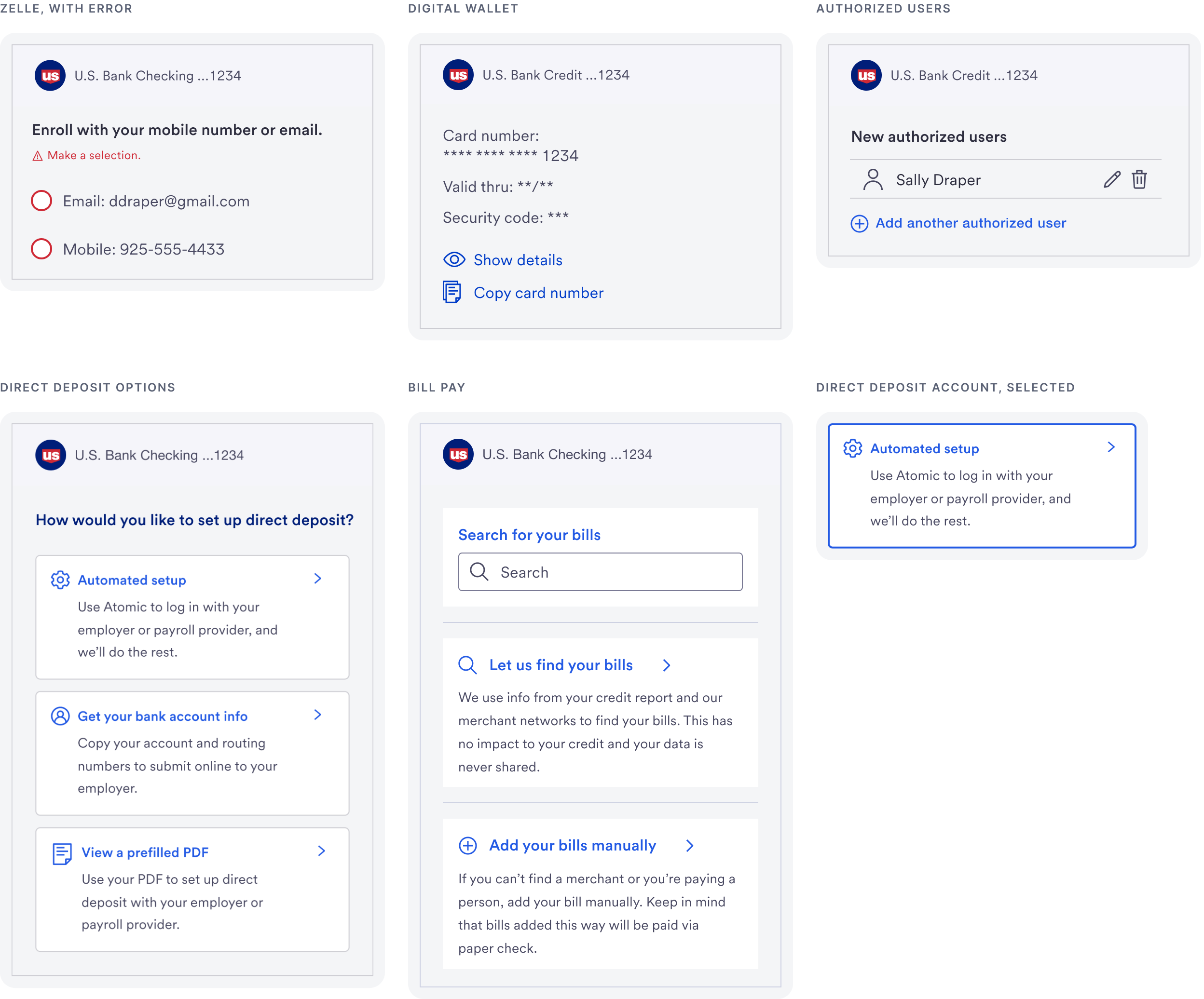
Zelle, digital wallet, direct deposit, bill pay, and authorized users each reuse the tile, heading, content, and button patterns, with their own states and errors.
Forms and Validation
Clear errors for sensitive information
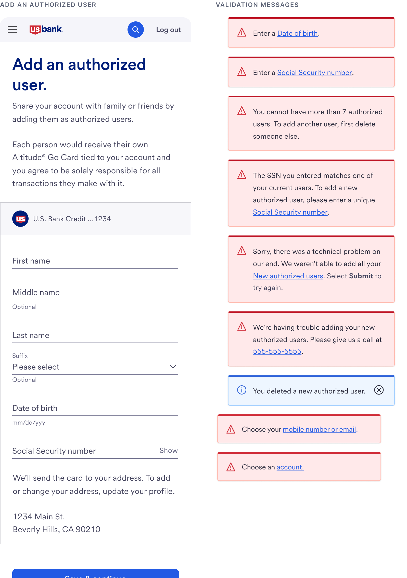
The authorized user form collects personal details, so every field has a specific, plain language error for invalid, missing, or duplicate entries.
Flow Mapping
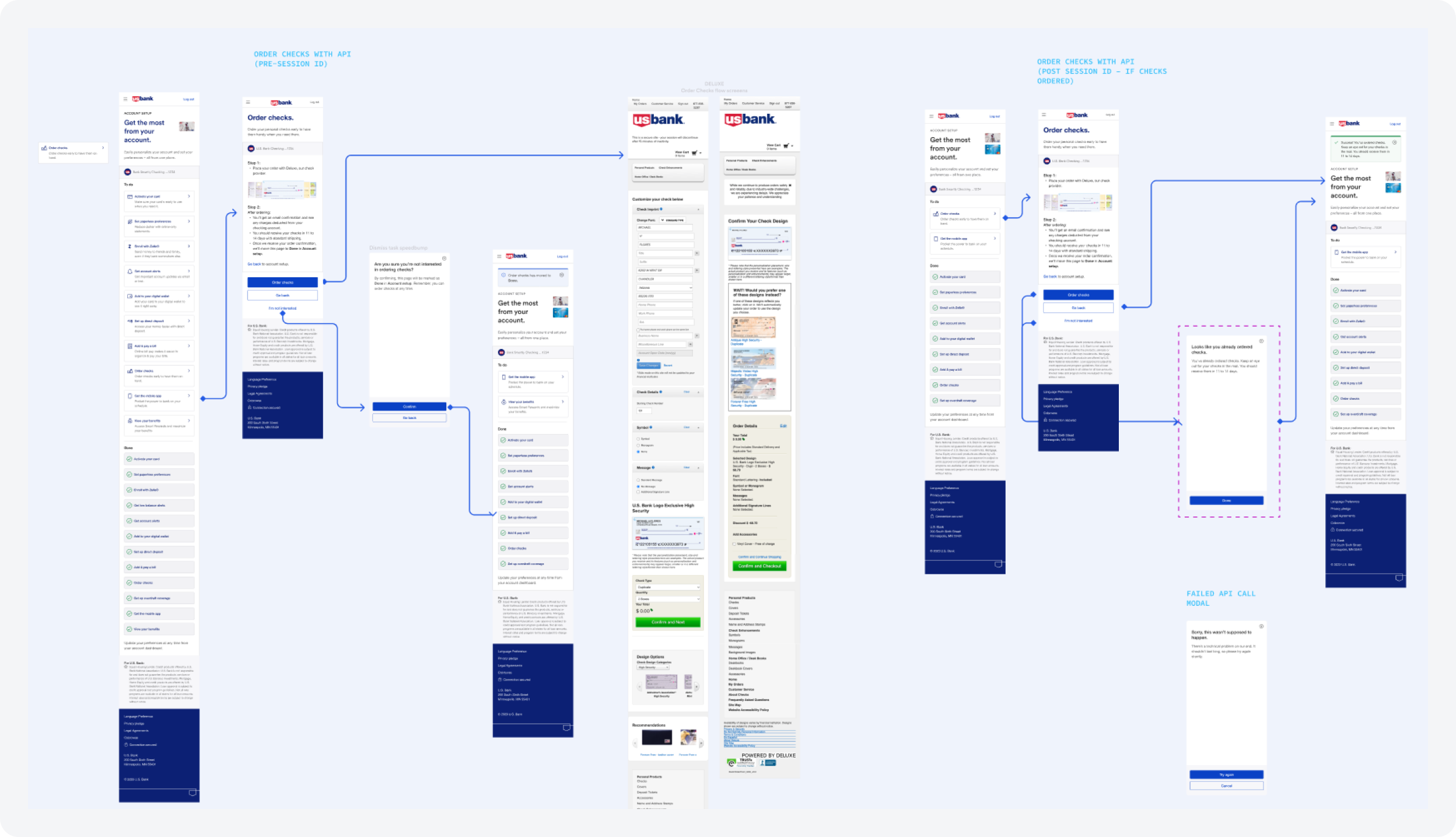
Every path mapped before handoff
For tasks that depend on outside systems, like ordering checks, I mapped each API state, including already ordered, not ordered, and a failed call, so engineering knew exactly which screen to show.
Handoff
How engineers used the system
Every component shipped with documentation engineers could build from, not just a picture of the final screen.
Annotated specs.
Every flow had interaction rules, business logic, content notes, and accessibility notes beside the screens.
Jira and Confluence.
Specs and acceptance criteria were linked to each ticket, so QA checked against the same source.
Dev Mode.
Engineers inspected spacing, colors, and states directly in Figma.
Walkthroughs.
I reviewed each component with engineering before build and checked the build against the spec after.
Rebuilt documentation for the Task Tile, showing how each Figma property maps to a code prop.
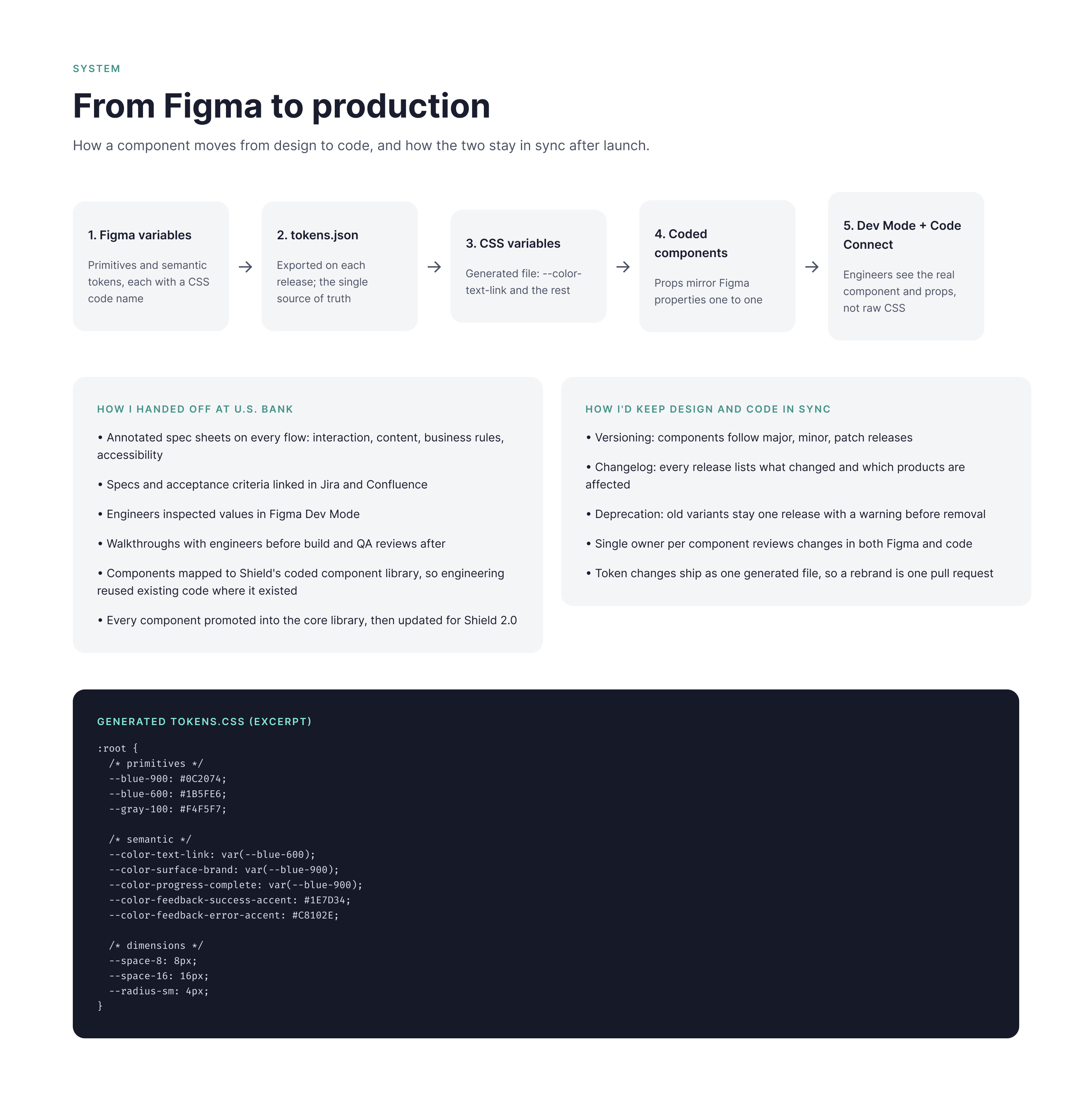
Design to Code
Built to translate directly into code
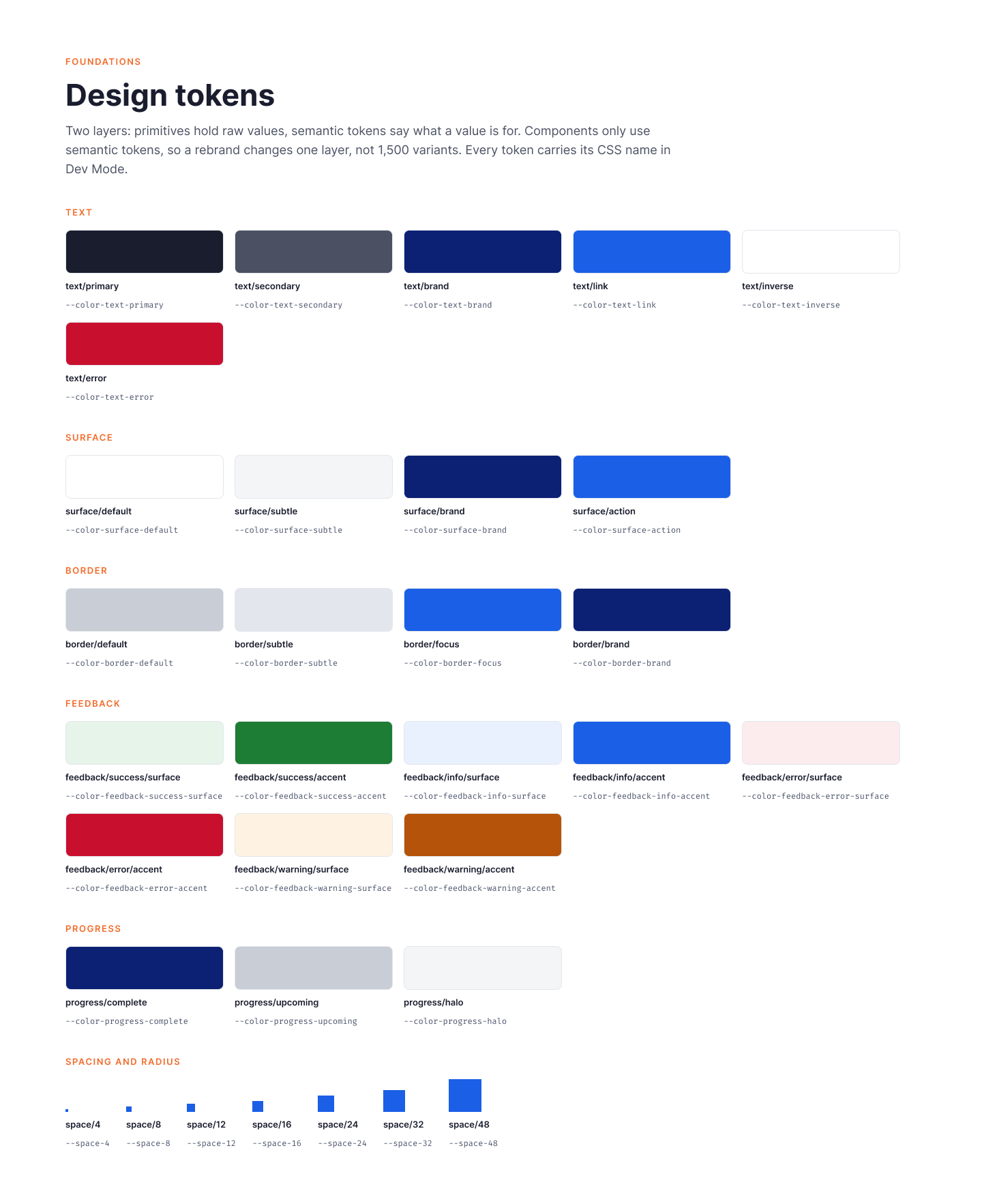
My components were built on Shield, which already had a coded component library, so engineering reused existing code wherever it existed and only built what was new. To show how I structure components today, I rebuilt the core onboarding components with real properties, design tokens, and a matching coded version.
Real properties.
Variants for state, booleans for optional parts, text properties for content, and instance swaps for icons.
Design tokens.
Two layers of Figma variables, primitives and semantic, each carrying its CSS name so Dev Mode shows production values.
Mirrored in code.
Every Figma property has a matching code prop, and components are built only from tokens.
Button components
Icon set

Rebuilt for this portfolio to show how my Shield onboarding components map from Figma to code.
Impact
New patterns, available to every team
Added to Shield.
Every onboarding component became part of the Shield library for all U.S. Bank design teams.
Reused beyond onboarding.
Other product teams used the components in their own flows.
One set of patterns, eight product lines.
The same components served credit, deposit, lending, and partner products.
Trust with engineering.
Testing replaced debate, which made future additions to Shield easier to agree on.
Reflection
The best way to scale a design system is to extend it well. Building on Shield meant engineering could trust the new components from day one, and adding them back to the library meant the work kept paying off for other teams. Next time, I would track adoption and handoff time from the start so the impact is easier to measure.